EDITED
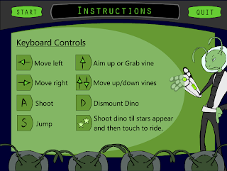
Okay this is the last one for now I will be working on the final sketches for the next interface menus.

EDITED
Okay I changed the one side of the backing boxes to straight and fixed the grammer error.

EDITED
I fixed the words a little more and placed them a little better i think on this one.

Here is a new version of the main menus instructions screen let me know what you guys think. I will keep working on it till 230pm today and post some more versions if I can.
All these files are in the box.net account under my folder under revised intructions.
ReplyDeleteThese are looking sweet! I have some questions though. Why is the glove behind the light green layer?
ReplyDeleteIs the "light" coming out of his glove? If so, it should be more visually apparent.
I'm not so sure about the "touch dino when you see these" statement on the bottom pic. It hangs outside of the light green and looks out of place.
Other than that, I really like these!
Great work!
I really like it the final one should be fine. It will fit and people wont go crazy looking at all caps. Keep up the good work Malina.
ReplyDeleteThis comment has been removed by the author.
ReplyDeleteI still think the buttons need to be somewhere else. I believe it breaks the consistency to have them on the frame. They also may need to match the main menu buttons. Those say things like "Start Game" and "Quit Game". These just say "Start" and "Quit".
ReplyDelete